This came up briefly in our Tuesday's Haslam reading and I came across some cool examples after Tuesday's blog. Type-based design always interests and inspires me, but this week in particular it has really caught my attention. Type used to illustrate or express an idea can be so effective, and often can be difficult to execute well.
What are some examples of type as image or type-based design that you admire (or dislike)? Do you think they're necessarily more effective when it comes to book design?
Here are some examples of what I find to be spot on:
I love how the words of the title flow seamlessly into this design, interweaving with elements from the story.

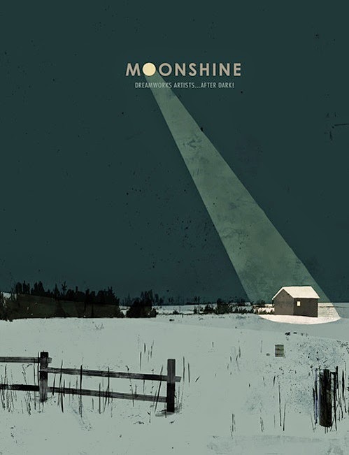
This cover (artwork from DreamWorks animation, so of course) is minimal but so clever.
This is not a published example, but I find it interesting how the thin stroke of this type is extended vertically to convey the message of the story.

One of the classics. Again, not published but still another simple but effective solution of using type as part of the design.
