Tuesday, June 30, 2015

Re: Interactive Fiction

So, I've been doing some searching over the last few days, and I've found some interesting things. I think the "novel for pad" idea might most be addressed by what publishers are apparently calling "immersive fiction," so that might be helpful in your Googling; it seems that "hypertext fiction," which is (I think) what Amy means when she's discussing multiple entry-ways into a text, is no longer in fashion, as it feels very 90s website-y [see the Space Jam website for awesomeness not-entirely-unrelated to that concept] or book-on-floppy-disk/CD-ROMish.

I know the publishing term "immersive fiction" because it's a few clicks into this project:


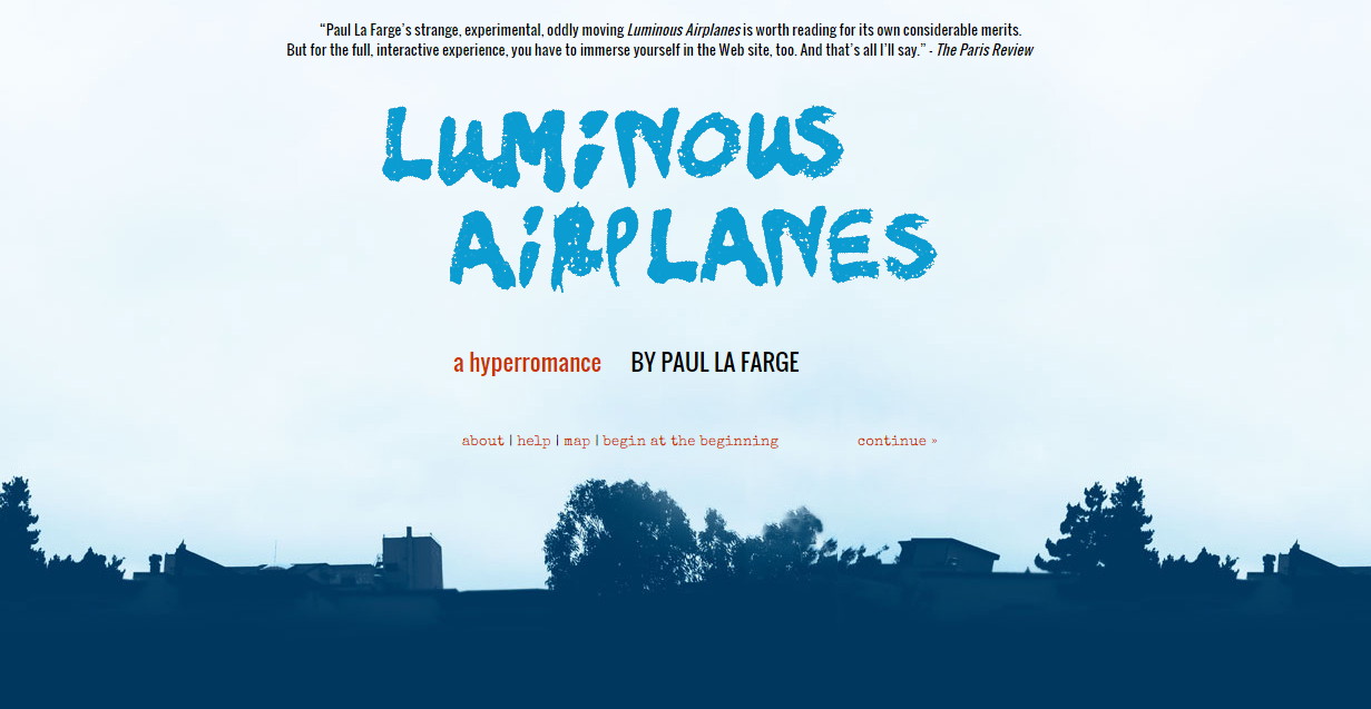
Luminous Airplanes, which is a hypertext/immersive site by Paul LaFarge, for which the main linear narrative was made into a print novel, though the website includes various other elements to the story that expand it, including commentary by the author on the parts he's written in the past, on the process of writing it, and conversations he's had with a friend who knew about the project and with the editor of the print novel. And, as is generally the case with metafiction or hypertexts, it's unclear whether the narrator is a fictionalized version of the author, or the author himself, or completely fictionalized--as the linear narrative part takes place mostly in a town where they have their own language, according to the novel's Amazon page [I clicked a bit but didn't really get into the Thebes part...]. Though the site is quite simply designed, I do think it's worth going in and clicking around to see how the linking works--there's also a map, which can be really helpful when you get a few rounds into the clicking rabbit hole, though I think that feeling of being overwhelmed and a bit lost is part of what the author had in mind, given the content of this project, which has to do with family, death, loss, grieving, etc., all of which is pretty overwhelming and maybe feels like getting lost...

That all being said, this isn't an app; it's a story designed as a website. The author also has a blog post on Salon called "Why the Book's Future Never Happened," which has some helpful background into the genre of hypertext fiction. His question in the essay is about why there haven't been more hypertext/immersive fiction projects; some of the comments make the valid points that these kinds of writing have developed into other genres. For example, one comment points out that we call online essayists/memoirists bloggers, and another draws the link to gaming, that many video games incorporate/immerse the player into the narrative of the world they've created. And in my searching for "immersive fiction," on iTunes, it seems like the category "games" is applied often to projects that could be similar to what Amy has in mind, the difference being that we're starting with a narrative that's already created [I guess you could say we're gamifying a novel?]. Check out the screenshots for Device 6, a game by Simogo AB:


From what I can tell, the idea of hypertext/immersive fiction is that the reader has control of the narrative's structure--sorry, Keith, you're framing the story now... Andrew's book from project two, Nabokov's Pale Fire is one of the texts often pointed to as a hypertext novel before hypertext linking was an option, so think about that structure--you can read it straight through, but you also can flip back and forth from the notes and commentary to the original linear narrative part. And the individual notes are like little linear narratives that branch off from the main poem. Which brings up a story that includes the prototype/image that most people associate with hypertext fiction: "The Garden of Forking Paths," by Jorge Luis Borges. It's form is a statement by a Chinese professor/spy for Germany during World War I, who realized he was about to be caught by the British, and figures out a creative way of getting important information to the Germans. It's short and absolutely well worth reading for many reasons, but here's the section that applies to hypertexts, in which an expert in the spy's ancestor's literary masterpiece called The Garden of Forking Paths, of course, explains its underlying structure:
Your ancestor did not believe in a uniform, absolute time. He believed in an infinite series of times, in a growing, dizzying net of divergent, convergent and parallel times. This network of times which approached one another, forked, broke off, or were unaware of one another for centuries, embraces all possibilities of time. We do not exist in the majority of these times; in some you exist, and not I; in others I, and not you; in others, both of us. In the present one, which a favorable fate has granted me, you have arrived at my house; in another, while crossing the garden, you found me dead; in still another, I utter these same words, but I am a mistake, a ghost.
And the idea of hypertext fiction is to recreate that structure with a narrative so that a reader can experience all of the possible ways a story might unfold and all of the choices a character might make and all of their consequences. In one section of Luminous Airplanes, LaFarge brings up the inevitable comparison to "Choose Your Own Adventure" novels when he says he's writing hypertextually; he talks about how he used to read those books straight through, linearly, so
Characters died and came back to life; the treasure was found before it was buried; the mayor of Sleepytown confessed his guilt then went up to Murder Hill, to wait for me in the basement of the abandoned house. The story was so much more interesting like that! You had the kaleidoscope thrill of knowing what was going to happen, but not what would happen next.

Plus, you were in several worlds at once: things were true not in an either/or way, but in a both/and way. You were guilty and innocent, brave and timid, safe and in danger at the same time. Which, it seems to me, is a much better representation of what it is like to be alive than your traditional single-path story in which either/or logic usually prevails.
So, that's kind of how I'm envisioning this last project. We're taking an existing novel and restructuring it so that we can give the reader a both/and way of reading a novel. You can read it straight through AND you can read all of the sections that are commentary at once, AND then all of the sections that take place in Thebes at once, AND then all of the sections about Norman Mailer's car at once [these are all elements from LaFarge's site], AND then just click around the map for a bit.

Terribly easy, no?

Re: Tactility

I agree with previous posts that the printed book will ever fully disappear. The environment certainly may change - where purchasing a book becomes more like purchasing a piece of artwork - more expensive but also preserved with care, displayed in the home, etc.

I've tried to go e-book, but for some reason struggle to read it with as much earnestness as I do printed books. Not sure why this is the case, as arguably it is easier to read due to the ability to customize your reading preferences with text size and screen brightness. Plus, I love to add the book to the shelf when I'm done, and occasionally return to my shelf just to take a stroll down reading memory lane, pulling out books to feel their covers, smell that glorious old smell (many of my books are for 5 for $1 old Goodwill finds). I'm notorious for adding those slender post-it notes to the passages I love most. Sometimes I just pull them out and read them.

An example of one of my old notes in Don DeLillo's White Noise:

"Don't think I wouldn't appreciate a dramatic visit between two and three in the morning," he told her, "from an intelligent woman in spike heels and a slit skirt, with high-impact accessories."

Love that quote. E-books will never capture this experience for me. Additionally, with all the DRM related problems that continue to get worse, I often wonder if I truly "own" the e-books I've purchased. One little change in software and maybe I won't be able to access books I've paid for. I imagine soon that I'll need a kindle to read certain books, an iPad for those books, etc. 50 different apps and/or electronics, what a nightmare!

I actually prefer paperbacks to hardcovers. They are usually smaller and easier to hold, and the covers  often have an amazing texture. The books I'm bringing as options for our 3rd project are examples of this awesome texture.

Re: Tactility

I definitely think the look and feel of a book can interest me in the purchase of it. Especially if it has textured paper. Another piece I really enjoy, even though it's mostly seen in children's books, are pop-up books. They always peek my interest because when creating it, you have to think of your design not only in 2D elements, but 3D. I actually have an entire book on how to create pop-up features for cards, books, etc.
While some of the pieces can be very intricate, some of them involve simple cuts that can make a design do something that it simply just cannot do on flat paper.


And I mean, how cool is this?


Monday, June 29, 2015

Interactive Fiction

It’s time to talk about interactive fiction. This is new to me. I don’t have much experience with electronic books but I can see their appeal. It’s easy to carry around a whole library with you. As I mentioned in my last post, it’s easy to search and make notes and to change the typeface and colors. Both paper books and electronic books have their appeal.

As I started to research interactive books, I was a bit turned off as I saw a lot about gaming and choosing different paths in a story. I’m not much of a video game person, and the idea of choosing what will happen next in the story just doesn’t appeal to me. I want the author to tell me a story. 

But as I saw more about added features such as pictures, videos, documentary footage, maps, integrated animation and infographics, I thought this was exciting and has promise. I thought this was a great introduction, a TED2011 presentation by Mike Matas:


The interactive transcript is here.

What have you found in your research on interactive books? What experience do you have with these? What cool ideas can you see implementing in your design? What comes next?

Re: Tactility

I personally like books that are different I think my favorite book I have is this copy of Train Dreams by Denis Johnson

One of the things I like most about it is that the cover is printed on this soft canvas paper with rough cut pages inside. The book itself is very rustic and the materials and how it was made really help with the overall experience of reading the book.

Re: Erin's link about Amazon noting deckled edges because people think it's a mistake:

If you've seen Kidd's TED Talk, you'll recognize this anecdote from the TED Blog post about it, Helen Walters's "Creating Visual Haikus for Stories," in which Kidd delights in a consumer (and even better, a bookseller! though, granted, this was an airport bookstore, if I remember correctly) assuming there was some kind of shipping mistake with his tongue-in-cheek cover:

Augusten Burroughs: Dry
This book was about the author confronting alcoholism, and so Kidd wanted to create a sense of “typography in denial: it’s lying, desperately, hopelessly, the way an alcoholic would.” He printed out some type on an Epson printer, taped it on a wall, and then threw a bucket of water on it. The printer put spot gloss on the dripping ink on the press and that, he said was that. Apparently, Burroughs himself watched a lady take a copy of the book to a cashier in a bookstore. “This one’s ruined!” The reply: “I know lady, they all came in that way.” You can tell this thrilled Kidd.

Kidd's commentary from the video: "Now that's a good print job."

Re: Tactility

Many of my books have deckled edges; I'm sure there have been various occasions when I've chosen the deckled-edged version when faced with a decision between editions. I agree with Erin that materials are always an important choice for a designer. I think Allison told us in Type that we should always choose our paper before even beginning a design as the paper would alter colors, determine what size type would be legible due to its amount of bleed, etc. But, as we discussed in the printers posts, I've always printed in the lab so I've let myself default to the paper that's automatically there. I've bought some paper online for the final version of the book--hopefully it arrives and is what I want it to be in terms of how it looks/feels.

To answer your question(s), Andrew, I do think that certain materials make more sense for some books than others. While I like a deckled edge, and imagine that it would be a nice touch for just about any novel, I go back to the design for 1Q84, which I love so much. Those decisions made sense for this strange novel about an alternate universe where really strange things happen and the fantasy novella written by a seventeen year-old turns out to be true, but it might seem completely excessive to use a vellum cover like that on another novel. I love little touches like spot varnishes and sometimes even embossing, but they have to make sense conceptually with the design and the book.

As to Shannon's question, I haven't been in person to any paper stores in the area; I've heard good things about the Paper Source (again, I think that was from Allison...?), but so much of what is available is online only, and you have to guess and hope with that. Jeanne talked about getting free paper/ink sample booklets, and though I've looked online at the booklets from Mohawk, I haven't requested any yet.

For the publishing industry, though, I'm not sure entirely how much choice the book designer has in the matter of materials, to address another of Shannon's questions. It seems like in book design, more than in other areas of design, there are so many people involved in the decision-making process that it could be difficult to get the publisher to take a chance on something more expensive. Yes, I think it's definitely more likely that they would splurge on materials for a book written by someone well-known (again, look at 1Q84: Murakami is one of the most well-known authors writing today, that novel had become somewhat of an event because he'd worked on it for so long, he has a following/what publishers call a "platform"--he even has his own drinking game and stickers based on tropes he tends to use--and everyone knows that what he writes is going to be weird, so the readership would probably expect a novel design that is a bit singular as well as a bit luxurious). But a novel's design moves from the designer to the art director, to the marketing team, to the editors, to the author, and at any of those places, there are recommendations and decisions being made about the design.

And I think size decisions are made even before the design is started, so that would be where the paper quality decision is made (as it would determine spine size). Also, there are usually certain consistencies among books from the same imprint--Knopf or Penguin would probably be more likely to use deckled edges than their subsidiary crime fiction imprints, for example--and imprints have series that also probably limit the designer's choices as to more expensive materials. I think it's a decision made between the editor(s) of a specific novel and the art director of the imprint how many pages a book will have, how large a format they'll use, the print run, and the materials. So, while a designer may be able to argue for extras with certain books, it's not always the designer's decision. That being said, I'm not sure how much more say designers might have at independent publishers.

Re: Series Design

As a child, I actually owned a lot of the Nancy Drew books. My mom grew up with them so she insisted that I did too. While I never finished reading all of them, even now I remember the consistence (for the most part) that each book design had in the series. You can see below that there is a consistency (again-for the most part) between the font used, colors, and overall subject of the design (the character Nancy Drew illustrated within a scene in the book) which I believe would fall under the "signature illustration" Mary Beth described.


Then there is the Diary of a Wimpy Kid series that falls under the "aligned spine" and "title placement" category.

And lastly James Patterson's series which falls under the "minimal approach" with " 'striking' " graphics (which is more like an overwhelmingly amount of type placed on top a photo).


Sunday, June 28, 2015

Re: Tactility

The feel of a book has influenced former purchases of mine. I have to agree that even though e-books are great (saving trees), you can't beat the feeling of holding a physical book. I've explored paper choices for a few of my projects and I'm excited to choose the paper for my final book. Does anyone have a good place they find their paper? I've been to The Paper Source in Annapolis, which is a great option, especially for those of you like me who love stationary.

I found a recent article online that says physical books sales are back on the rise this year (2.4%). The article breaks down the reasoning this might be happening into three categories: comprehension, non-intuitive tools, and human factors. In the last category, the author Frank Catalano states, "For some types of reading, the physical act of opening a thick cover and listening to the whispered crackle of spine and pages is part of the enjoyment." You just can't get that with a Kindle.

Another website I came across mentioned the obvious factor of cost. How often do publishers allow a book designer to choose the more expensive paper? Does the book or author have to be well known before printing in order to cover those costs? Even though I don't want to become a book designer per say, it would be interesting to understand the decision making process more.


Re: Tactility

I have noticed that tactility definitely plays a role in a person's book buying experience. For me, I will pick up a book that looks interesting and feel it, open it, run my hands across the words of the title, turn the pages, etc. I never knew that it was called "deckle edging" but I do enjoy when the paper is just a little different. I think the tactile experience plays an even more important role nowadays when we don't have to buy the physical book...we can usually find the e-book instead (or even the audiobook). There is a tactile experience with e-books too, as Keith pointed out, but physical books can offer a more stimulating experience. My copies of the Series of Unfortunate Events books and The Count of Monte Cristo all have "deckle edging." I appreciate this because the stories take their readers to a different time and place, so it helps to have a physical representation of that. The paper reminds us of a time when everything wasn't machine made. And I don't just buy a book to read it. It's eventually going to join the rest of my books in my bookcase. I can pick it up and feel it again and again. I may even be more likely to reread the book.

Re: Tactility


Materials of a book, or any material in general have a significant impact on experience for users (in my opinion). I think it is definitely a key ingredient in the storytelling element of the book cover itself, and the many reasons you may move to purchase and cozy-up with a book.  Much like we have discussed that the art should hint at the story of the book, but not give it away – I think the sensory experience of touch plays just important of a role. The texture can hint at a mood – much like a finely woven Egyptian cotton bed sheet (vs the sale item at Walmart) can make you feel pampered.

An example I came across, when reading this article titled, Cover Stories, interviewed Coralie Bickford-Smith (there she is again!) about her cover design for the novel “Robinson Crusoe.”  (I just have the PDF - wouldn't let me attach it here). She settled on a moon design, but pay attention to the tactile qualities:

She was tracking illustration styles and printing methods, but she also remembers seeing the same imagery over and over: Footprints in the sand or a guy with no shoes on a deserted island. "This visual language has become a shorthand for 'Robinson Crusoe,'" says the senior book cover designer for Penguin U.K. "I tried to do something totally different."

The clothbound series always features one illustrated object on a grid, and Bickford-Smith decided on the moon. It communicates the solitude of looking up at the night sky, and the moon's phases mark the passage of time. Her woodcut style illustrations are embossed in white matte foil on dark blue cloth.

The white matte foil, and the cut and grooves of the lines on a soft, deep blue cloth cover definitely communicate something to be uncovered, the journey the character is about to take. The thought of the materials coincides with the actual graphic design. Something shining on a deep, rich background, much like the night sky. I can imagine this is lovely to the touch. Think how differently this would look and feel on a cheap or glossy cover? How different it would look? What would that communicate?


Andrew, I agree with you in your love for letterpress and think it gives such a richer experience. I personally letterpressed our wedding invitations and took great care in picking paper – it was soft and warm, but rich with texture (I went with lettra 300gsm…swoon)– it was important to me to provide this sensation of an outdoor wedding near the beach, which was not stuffy-formal but also not a “show up in your shorts and flip flops” type beach wedding. Here, my paper and printing style helped to set the tone of our wedding, much like the paper/printing choices set the tone for the book you are about to experience. 

Of course the inside pages would seem to be just as important for experience as the cover.  As far as the edges of paper go, clean or deckled – I hadn’t even thought about this. I actually think deckled edges would work really well for my final design for my novel if I could execute  it.  I found an interesting article on the deckle edge history/choice in the printing world here  - and the debate whether users think it is a mistake, a defect or a fabulous artistic quality added to the book.

An excerpt:
An artifact of bygone days, the "deckle edge" is part of the modern fetishisation of the past, much as Instagram glorifies the 1970s snapshot camera. An artefact that might have annoyed the makers of the day turns into a trait intended to evoke the whole experience and emotion associated with the original, but without any of the baggage.

Great, timely topic discussion - I'm still considering choices for my final design!

Re: Tactility

Andrew's topic of tactility is a good one as we move from paper books to interactive ones. As Josh Catone wrote in "Why Printed Books Will Never Die" on Mashable in 2013:

But there's something about print that I can't give up. There's something about holding a book in your hand and the visceral act of physically turning a page that, for me at least, can't be matched with pixels on a screen.
Aside from looking at a book and enjoying the cover art and the way it looks and is organized inside and the experience of reading the book and being transported to another world and maybe learning something to boot, you've got the sensory experience of holding the book in your hands and feeling the texture and weight of it. Maybe you can even smell it too, that dusty moldy old smell or the chemical smell of the fresh ink and paper.

Of course, we do have a tactile experience with electronic books as well but it's the same from one book to another. Hit the button to turn the page. You still have the visual experience, which can be similar from one e-book to another. But e-books do have their good points. You can actually change the look of the book, choosing large or small type; white, black, or sepia background, and moving page by page or scrolling. It's easy to search and to make notes, which are great when doing research and writing.

Both paper and electronic books have their good points. As Catone says:

But the choice between e-books and printed books is not a zero sum game. Print books do not have to disappear for e-books to flourish, and e-books don't have to be the only choice. 

Friday, June 26, 2015

Re: Tactility

This is such a great question because I struggle with it CONSTANTLY throughout this program.

In my most recent struggle, I was at Staples asking about what thickness of paper to use for my short story - as the person helping me explains that it is totally up to me and there are many different thickness and textures to each paper and to feel them and choose the one I want.

Needless to say, it did not help much and I ended up having to use my own judgement. In fact, this same question came up TODAY before I went to buy a large pack of papers to start folding for my book.

I remembered Jess saying that 32b is good for the inside because it is thicker than generic 20lb thicker paper, but won't bleed through the other side. As I work with this paper I can definitely see the difference.

From my experience, it seems you really have to use your own judgement, work with different thickness and textures, and do lots of printing samples before you find exactly what you want to use.

Here is a little scale of paper thickness from thinnest to thickest:


I can't tell if this is legible - but the lightest paper is super thin at 9 lb. and the heaviest paper is super thick at 130 lb. 

HUGE DIFFERENCES!! Before becoming a designer, never in my life would I be thinking about how big and important the paper world actually is.

Re: Book Series

I know I am posting this super late - but I wanted to get it in before it was too late.

I found this book series called "GONE" by Michael Grant for the YA (Young Adult) and it really caught my attention because of the simplicity and dark design of the series:


Even though it has a really dark feel, I think it is really pretty with the neon colors on the dark background - something different. I am a big fan of how these books carry the same design throughout the series.

The books are supposed to be post-apacolyptic/sci-fi - "a mixture of Lord of the Flies and X-Men".

Tactility

Our collective descent into OMG Perfect Binding?! has made me think about texture—how do books feel, and why is that important?

There's weight, and there's texture, matte covers and deckle edging:


These are critical choices in the creation of a book experience. They signal any number of aesthetic qualities about the book and its content. There's been a great resurgence of letterpress arts. Personally I love a the feel and look of a heavy card stock with deep impressions. It feels more real, more of this world.

Materials generally signify quality in a basic sense, but how do they help bring out more of the book itself? Are there situations where a matte cover is weird? Can a vellum dust jacket be used in any situation? You don't have to answer these specific questions, but I am curious about your experiences with texture and books. What do you prefer? What sort of snap judgments do you have about a certain material choices?

Re: Book Series

I didn't know where to start with this topic, honestly. My immediate knowledge of book series is confined to fantasy literature, and that's just not that compelling to me. The other day I was talking to my brother, a newly minted and licensed psychologist, and he mentioned that some of his coworkers were talking about a beautifully designed series of books on psychoanalysis. Google came through (though it's the Portuguese version):


From the website: "The client requested a series of low budget covers with graphic impact that would differentiate themselves from the other books available on the subject. Although the design should differentiate these books from the self-help category they intentionally look accessible for the majority of the audience – professional or non professional."


Bold coloring, and a poetic use of simple punctuation to illustrate complex mental situations. It's almost too derivative, but overall I think this is pretty effective. It reminds me of pamphlets at the doctor's office covering blood pressure and STDs and the like, yet ~100x more aesthetically approachable.

I sometimes wonder if the effectiveness of this sort of design is in part because we are so constantly bombarded by media. There's something emphatic about a bold color and a simple shape that is at odds with everything-is-everywhere modern media.


Thursday, June 25, 2015

Re: Book Series

So while searching for well designed series, I came across this blog: The Art of Book Cover Designs. This blog gives examples of many great series that were either the original designs or redesigns. Here are the ones I thought were worthy of posting:


Like Katie, I dug a little deeper to find out more about the designer. I was very interested in the redesign of Catch 22 (Rachel, this may be inspiration for your project) which was designed by two people. I came across their Behance page and here are other books they have designed:


Re: Series design

I love seeing a set of well designed series on the shelf at a bookstore. I did some searching for ones I have not seen and came across three Penguin series to share. I know several of you said you were (very) over Jessica Hische, so brace yourselves, here she is!

Penguin Drop Caps is a series of twenty-six collectible hardcover editions of fine works of literature, each featuring on its cover a specially commissioned illustrated letter of the alphabet by type designer, Jessica Hische. Each gift-sized book features a foil-stamped case and a decorative color stain on all three paper edges. As a whole, the series design encompasses a rainbow-hued color spectrum across all twenty-six book spines. 


I found two more series by Coralie Bickford-Smith (she was mentioned in a previous post), senior designer over at Penguin. The first ones are covers for the Great Food series. They elegant, homey and thoughtful, using elements from your kitchen over wallpaper type backgrounds:


 An interesting series using color and illustrated, geometric design


Re: Series design

I really love children's book series because they're usually designed so pretty, my favorites though are the Guardians books by William Joyce.


The newer editions of the Nicholas St. North book has a back cover the matches the rest I have an older version. 

Re: Series Design

One of my favorite series design [I'll admit my knowledge of this area is pretty limited, I'm not really a series reader], which I'm pretty sure we already posted on here for another topic, was for Fitzgerald's books. So pretty and appropriate.
It made me interested in learning more about the designer, which may be a name familiar to you guys, but not to me: Coralie Bickford-Smith

Her book designs are so cool! If you want to view her website, here it is: http://cb-smith.com

A bit about her: "I graduated from Reading University after studying Typography and Graphic Communication. I currently work in-house at Penguin Books. Amazingly my book covers have been recognised by the AIGA (NY) and D&AD (UK) and have featured in a numerous international magazines and newspapers including The New York Times, Vogue and The Guardian. The work I did with Penguin Classics on the clothbound series attracted worldwide attention and harks back to the world of Victorian bindings and a golden age of book binding."


Here is a great article she did on The Casual Optimist blog. They ask her about her process (of course) and I really connected with her answer:

"Could you describe your design process for book covers?


The first stage of every new cover is nerves and self-doubt: can I do something interesting, visually smart and get across the fundamental nature of the book and help it sell? Nightmare. So I get reading and then try to throw away all my concerns and fears and start getting stuff down on the page, sketching on paper and working things out on the computer. Usually that means trying out a lot of rubbish and having to trust that eventually something will emerge from the process that works. When that happens I can breathe a short sigh of relief and then get on with developing and refining until the cover is finished."

A few other book designs of hers. 
[Austin collection]


Her Penguin Pocket Classicsdescribed as "Two tone fine linen bound hardbacks with matt foil stamped into the binding."


Re: Series Design

As far as I've seen, Melville House Books wins hands-down when it comes to series design. All of their books are lovely, but they definitely know how to do series:

The Art of the Novella Series: Many of these novellas haven't ever been printed in book form (at least not on their own, as many novellas are included with short stories or with another novella, etc., to make the printing size of a regular book). The novella is a difficult thing--for writers as well as publishers--as it exists in this kind of in between space and is really based only on that in between length. But I think novellas that work have this crystalline impact that is kind of perfect. So here's Melville House's Art of the Novella Series:


For better viewing pleasure, and to get an idea of size:


Source for image: Melville House Books

So, bright color cover, consistent sans serif typeface, black title, white author name--really a quiet, attractive design that lets the writers speak for themselves, which makes sense when you're publishing (in some cases) lesser-known works from master writers. Also pictured in the bookstore window: Melville House's Neversink Library (the books with a white silhouette/cameo around the title/author. Fun fact: the pig silhouette is for the book Snowball's Chance by John Reed, a parody of Animal Farm, so it's appropriate that his cameo silhouette would be on the cover instead of a human head; also, the one on the right is for William Gerhardie's Futility [hence, the forehead against the wall/edge of the cover], so even though those covers are consistent as well, they have a little humor about them, too.

And one more Melville House series: the Last Interview, where Melville House publishes in book for the last interview with influential writers who have passed away:

Source for image: Melville House Books, the Last Interview gift bundle

Similar in some ways to the above--bright color, sans serif typeface, consistent design, but the use of the illustrations instead of photographs is an interesting choice and gives the series some levity, which seems somehow appropriate, to remember how these writers, who have taken on a larger-than-life status and are so respected, especially after they've died, to remember how they were human. In some ways, reading these would be like reading their last words, and that idea could go very maudlin, but the bright color and graphic quality of the illustrations prevent that while still lending some gravitas to the writers themselves, in my opinion.

Re: The Series

When I first saw the covers of the Diana Gabaldon Outlander series, I wasn't crazy about them. I thought they were too simple or plain. But they have grown on me over time, and I think they are very effective. They are all a solid color with a single illustration in the center, distinctive serif type for author's name at top and book title at the bottom. If you see them lined up on a shelf, they line up nicely with author at top, symbol in the middle, and book title at the bottom. I couldn't get into reading them but have enjoyed the series on Starz. Maybe getting into the show has helped the covers appeal to me, or maybe their appeal has grown on me over time. I like simple things and they get the message across without a lot of clutter, and each element of the cover is well done.


Another series that I did get into reading, at least for a while, is the Sookie Stackhouse books. These covers have always seemed cheesy to me, and even more so after seeing the slick, bloody, gritty vampires on the HBO series. The books went with the down-home quality of Sookie and the show went more with the worldliness of the vampires. The books all have the same type of naive illustration and the author's name in large type at the top (Charlaine Harris sells them) and the title at the bottom. Over time they moved away from the hand-lettered look (Living Dead in Dallas in 2002) to a more sophisticated sans serif face (From Dead to Worse in 2008).