Tuesday, January 31, 2012

Ugly Cover? No Problem

I've always had this problem that made it really hard for me to be objective about attractiveness in people. See, I think my favorite people in the world are the most beautiful, while my least favorite people are just plain ugly. Since I know it's unlikely that this is true, I just accept that my warm and mushy feelings toward people, things, and animals (baby sloths!) make me look past any flaws and/or creepy sloth paws to find them visually pleasing.

Which brings me to this- do I only read books with attractive covers? (No). Or do I begin to get mushy feelings for good books and forgive poor design? (Probably yes). I also have this feeling that the uglier something is, the more endearing I find it, which is really best for me not to think about, given my very high opinion of myself.

Anyway, I checked over my bookcase, and realized that the only books there that were straight up ugly were my husbands books that I haven't read (which probably plays into exactly what I was saying above, so I'll just move on.)

If I have to be honest, maybe the book that isn't QUITE as lovely as the others is The Bell Jar. This is the edition I currently have: Like millions of angsty teenage girls before me, I first read this in high school and fell in love. Such ennui! Such madness! But I don't know about that cover. Loving the book as much as I do, I can make the cover fit. I can understand it. Heck, I looked up about 40 different covers for this book, and yeah- I could make them work in my mind. But they're just not what I would pick. Maybe when you really get attached to a story, it's impossible to come up with a cover design that is worthy. Did I just fail the class? I think I need to hand in my design student card for saying that.

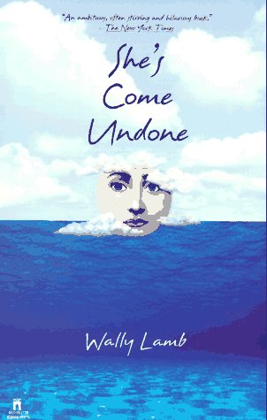
Of the zillions of different edition covers that I saw for this book, this one might be my favorite:
And, rant over. Am I the only one that just cannot find fault with a beloved book?

Which books do you love despite their unattractive cover design?

To answer your question Meredith about "Which books do you love despite their unattractive cover design," I would have to answer The Girl With The Dragon Tattoo. I read this book in 2009, and was really into it. The first edition paperback of this book was to me, terrible. No, not terrible, more like cliched. I think I am a little put off by the fact that the image on this cover was so literal…..a girl with a dragon tattoo. How original right?

I may not have been so opposed to it, if it were a little more artfully shot, a little more creatively laid out. But as this cover version stands, it is too straightforward. True, it is provocative in that this girl will possibly have an interesting story…..but what disappoints me is that the title itself is asking the reading to be piqued by the story, then gives you a literal image that does not hint at any other elements in the story.

Thank goodness other editions of the book/series have been re-designed to be less literal, more artful. Those newer covers are so iconic right now, and thank goodness for this! Such a good read deserves a good cover design.

Monday, January 30, 2012

The Evolution of a Book's Design: Toni Morrison's "Beloved"

 Which books do you love despite their unattractive cover design? 
I've always been a big fan of Toni Morrison's books -- but always slightly disappointed with the book design. My first experience with Morrison's lyrical prose was "Beloved," for an English class as an undergrad.

I remember dismissing the book outright by the look of its uninspiring cover (granted, this was published in the late 80s) but afterward, reading it twice more, then buying more of Morrison's other books. Her prose is, simply put -- beautiful and often moved me to tears. I would finish reading a book and then look at the cover and think, this is the best they could come up with?

Over the years, the book cover has been redesigned numerous times, and I'm rather loathe to admit that my favorite one is the book cover based off of the Oprah Winfrey movie (and I HATE when books are re-released after a movie is made with a cover based off of the movie), but it is much more compelling than the other ones.

(this is the cover of the book I read in college)


(this is my favorite cover -- and the cover promoting the Oprah Movie)


(this one is just UGLY)

(this one seems like a re-design of the original)

Sunday, January 29, 2012

Extremely Loud and Incredibly Close

In reading this post, it seemed to me that book covers are so very subjective. Last summer I read Extremely Loud and Incredibly Close. A friend had recommended the book, but she honestly admitted she only picked it up because it had an appealing cover. She tried to explain that it was metallic and really caught her eye. She went on to tell me that the book was great and she enthusiastically recommended it. When I saw it in the bookstore, I realized I would have completely passed it by. The cover design did nothing for me. The book was actually very good and was exactly the type of novel that appeals to me, but had it not caught the eye of a friend I would have never read it just because of the cover design.

Now had the cover incorporated the twin towers and a little child, I would have probably picked it up and been curious. It could even have even had the image of a child knocking on a door and it would have raised my interest.


Books and Their Covers

I remember picking up Middlesex in a used book store and thinking, this looks like a good book, even though the cover doesn't grab me at all. I know that I have a tendency to be drawn toward books with glitzy or appealing covers, so sometimes I try to force myself to look at once that don't look interesting at all. Occasionally, I'm glad that I did. That was definitely one of those cases! I'm glad that I picked up and read Middlesex because it turned out to be a book I really enjoyed reading. It was a story I am normally not drawn to but raised a lot of questions and interest about sexual and cultural identity.

Another instance where the book cover completely threw me off was reading Jimmy Corrigan, the Smartest Kid on Earth by Chris Ware. This is a graphic novel that took me by suprise. I loved the cover because it wasn't anything like I had seen before. When they described it as a graphic novel, I didn't think that it meant the story would actually capture me the way it did in traditional novels. Just because it was written in a comic book fashion didn't mean that the story was a joke. I LOVED this book. Completely untraditional and held my attention the entire way through.

Shallow Covers

I wonder if, to some extent, we choose the books we do based on the covers anyway. I know I hate reading books with a picture of actors once its been turned into a movie -- I'm sure a lot of us do. Of course it takes it to an extreme to say "I'll only read books with covers that appeal to me," but we do it anyway. It's become cultural shorthand to see a book with a pink cover, an image of an engagement ring or a baby stroller, and know that it's "chick-lit." We know that gothic letting and an illusion to teeth and/or blood is probably going to grace the cover of a vampire book. Judging books by their covers saves us time of having to research each and every book we pick up to see if it's something that would appeal to us. Conventions save us time and mental energy.


Of course, there can be both good and bad covers that fit genre conventions, and I know that's more what we're talking about here, but I wanted to issue a challenge: please find a well designed romance novel. Preferably with Fabio.

Friday, January 27, 2012

Good Book, Bad Cover Design


When I was about 14 years old, I remember seeing a lot of my peers reading a book with a very colorful cover called the Coldest Winter Ever by Sister Soulja. I would see this book everyday on the bus and even during lunch. I began to wonder why so many people were reading this book. So, I began to ask if it was any good, and the amount of positive responses I received were amazing. I eventually borrowed the book from the library, and loved it! It was such an interesting story, and the fact that it didn't have a happy ending was refreshing.

Now, on to the cover...

Although I was only 14 and did not have a real understanding of graphic design, I was not a fan of the cover. For one thing, there were too many bubble gum princess colors (pink, purple, and sky blue) for my liking. I originally thought the book would be super corny because of the choice of color. This is why I couldn't understand why so many of my friends were reading the book. Another issue I had with the cover was the fact that Sister Souljah's name was very large. At one point, I thought this was the title of the book. Now, I know the hierachy just sucked.

Unfortunately, the cover of The Coldest Winter Ever doesn't do the book any justice. The designer could have done a better job of conveying the actual content of the book in the cover. It seems like all they knew about the book was the title and that "Winter" was the main character. And that's a shame.

Thursday, January 26, 2012

Judging Books by Their Covers

I heard a story recently about someone who made a New Year’s resolution to only select books based on their covers. As a design student, I found the idea intriguing. Products with nice-looking packaging often grab my attention faster and are easier to remember: books, movies, bottles of wine, cleaning products, etc. It’s only natural for people to be drawn to things that please them visually. This person will certainly encounter some fantastic artwork and potentially lesser-known literature as a result of their resolution.

However, their idea led me to think of all of the books I could have missed out on if I’d only considered the cover art. I’ve read some amazing books with rather unappealing covers, for example:


The Mysteries of Pittsburgh by Michael Chabon, Middlesex by Jeffrey Eugenides and She’s Come Undone by Wally Lamb.

I wasn't particularly attracted to any of these cover designs before reading the books and I'm even less attracted after reading the books. Although there's nothing "wrong" with the artwork, for me, the covers don't encapsulate the essence of the books or do the wonderful stories justice.

Which books do you love despite their unattractive cover design? Or which books were you attracted to based on their covers then disappointed in?