When books turn to movies the audience who's read the book can either be disappointed, elated or indifferent. Some people opt not to see the screenplay adaptation of their favorite book because they think the story will be ruined for the sake of a box office smash. One thing is for certain, whether the movie sticks to the story on the page or not, the cover is reinvented to be the mirroring image of the movie poster. But is the movie poster staying true to the book or catering to the over sensationalized market of the box office audience. Some of the examples I have are from books i've read and the movies i've seen and some i've either seen the movie and not the book or vice versa. Interestingly enough, it wasn't until today that I saw the original cover for The Perks of Being a Wallflower. Of these four books, this is my favorite as I tend to possess some of the wallflowerish qualities of the main character. I find the image of the wall shown from two different perspectives as an interesting choice. The original you only see a person's legs, while the movie, you see the top half of the main characters. Both keep with the use of green.
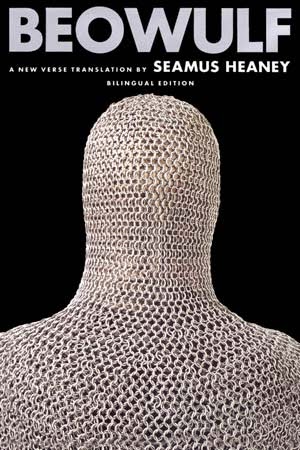
Persepolis, I would say, is the one that sticks true to the original text. Given that it is a graphic novel, I'm glad to see that there were no drastic changes for the movie poster. The new adaptation of Beowulf is an example of the commercialized perspective of a classic book that has been translated over and over. I am still a fan of the cover for Seamus Heaney's translation with it's simple black background and chained being.
I rhink both book cover and movie poster for the famous To Kill A Mockingbird are great representations of the text. While the book captures a significant element within the story, the movie poster in a nutshell sums up and highlights scenes from the text.