Rachel - I agree with Keith - I'd like to see everything bleeding off the edges a little more and drop "By." I definitely like the addition of the spot in the "O." The leopard is still a little awkward. I can tell, though, that it looks like you were going for the idea of him stepping off of the "E" and onto the "O" - that works, but it may need a little more tweaking? I'd still be interested to see what a bright orange background looked like.
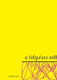
I also need some feedback! I've been playing with the placement of the front cover image and the relationship with the type and the chaotic lines. How do you all feel about vibrating the title and making it move into the lines with the pink type? Or keep it separate? General thoughts on size/placement? Wish I could have made it to the lab today but we had some house hunting to do. Thank you!!

