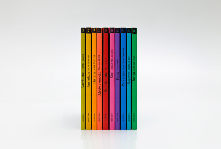
From the website: "The client requested a series of low budget covers with graphic impact that would differentiate themselves from the other books available on the subject. Although the design should differentiate these books from the self-help category they intentionally look accessible for the majority of the audience – professional or non professional."
Bold coloring, and a poetic use of simple punctuation to illustrate complex mental situations. It's almost too derivative, but overall I think this is pretty effective. It reminds me of pamphlets at the doctor's office covering blood pressure and STDs and the like, yet ~100x more aesthetically approachable.
I sometimes wonder if the effectiveness of this sort of design is in part because we are so constantly bombarded by media. There's something emphatic about a bold color and a simple shape that is at odds with everything-is-everywhere modern media.


